top of page

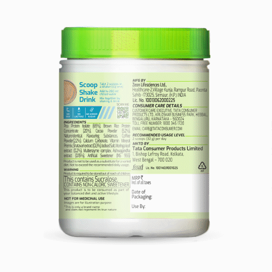
Tata Gofit Plant Protein
Empowering Wellness with a Bold, Feminine Identity
Tata Consumer Products partnered with Kanchize Design Studio to launch GoFit, a plant-based protein range crafted specifically for women. The challenge was to create a branding and packaging design system that stood out in the wellness category—balancing strength, femininity, and credibility.
Our Creative Solution
We developed a vibrant, empowering visual identity that resonates with modern, health-conscious women:
Logo & Brandmark:
-
A bold wordmark paired with a dynamic “Go” symbol, capturing energy and movement.
Colour Strategy:
-
Confident use of pastel green —a rare, standout choice in the protein category to form Brand colour
Visual Language:
-
Feminine yet strong Sports energy is created on the pack
We adopted a sports‑inspired typographic system—clean sans‑serif fonts with energetic forms echoing athletic magazine layouts—layered with images of women working out, evoking strength, movement, and zest. This combination communicates dynamic empowerment and freshness while ensuring clarity and visual appeal across SKUs.
The juxtaposition of these fonts and magazine‑style workout imagery results in a confident, sport‑led aesthetic.
Impact & Results
GoFit launched with a strong, differentiated presence across retail and digital platforms, reinforcing Tata’s commitment to inclusive, wellness-first innovation.
As a premier creative studio in Mumbai, Kanchize specializes in strategic branding design and packaging design that transforms purpose into powerful shelf presence.


bottom of page
