top of page

TATA Sampann Gulbarga Toor Dal
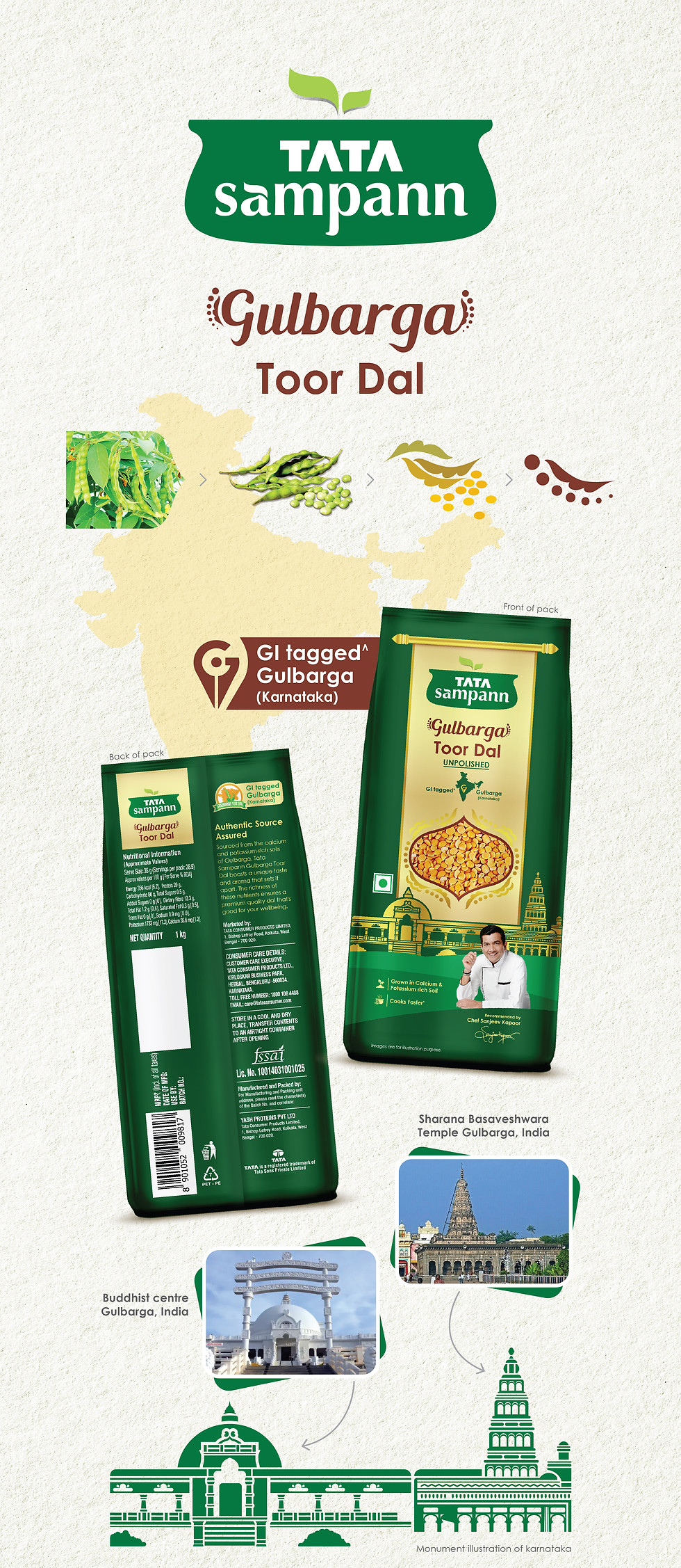
Tata Sampann set out to hero India’s regional agri-heritage through a curated range of dals, beginning with the Gulbarga Toor Dal. The objective was to create packaging that feels rooted, premium, and reflective of the product’s geographic origin - differentiating it in the cluttered commodities aisle.
Our Creative Solution
As a leading creative studio in Mumbai specializing in branding and packaging design, Kanchize crafted a packaging experience thats blends tradition with regal simplicity.
-
A hand-drawn illustration of Gulbarga’s landscape anchors the design in provenance
-
Dal pods arranged into ornamental forms inspired by royal Indian architecture
-
Product photography styled as “royal dal”—presented with richness and warmth
-
Earthy copper and deep tones evoke purity, authenticity, and richness
-
Clear visual hierarchy ensures both modern shelf appeal and regional storytelling
Impact and Results
The design elevated the perception of regional dals, positioning them as premium and provenance-rich. By highlighting the calcium- and potassium-rich soils of Gulbarga, the packaging deepened the product story and built greater consumer trust. It helped Tata Sampann carve a distinctive identity in the pulses category - enhancing brand differentiation, strengthening shelf presence, and resonating with culturally aware, quality-driven consumers.


bottom of page
