top of page

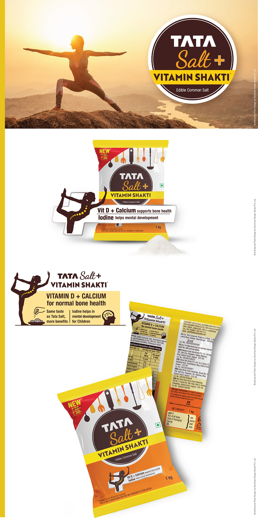
Tata Salt Vitamin Shakti
Designing Strength into Everyday Wellness
Tata Consumer Products partnered with Kanchize Design Studio to launch Vitamin Shakti—a nutrient-rich salt variant infused with immunity-boosting vitamins. The goal was to position it as a modern wellness upgrade while preserving the trust of India’s most loved salt brand.
Our Creative Solution
Concept
-
Positioned Vitamin Shakti as everyday wellness with the power of essential micronutrients and visualizing "Shakti" as a metaphor for energy and strength.
Design Language
-
Created a bold, energetic look that signals health while retaining Tata Salt’s layout layering wellness cues.
Colour Strategy
-
Used bright, vitamin-inspired hues like orange and yellow for vitality, balanced with white to convey purity and trust., appetizing colour palettes match the flavour profile—enhancing visibility and appeal.
Typography
-
Bold, clean type ensuring visibility and clarity with clear callouts to highlight vitamin benefits effectively.
Impact & Results
The packaging established Vitamin Shakti as a credible, enhanced offering in the daily essentials category. It retained Tata’s trustworthy image while highlighting the product’s modern, health-forward upgrade. The differentiated design drove consumer awareness and improved shelf visibility in a cluttered staples segment—setting a new benchmark in nutrient-rich everyday packaging.

bottom of page
