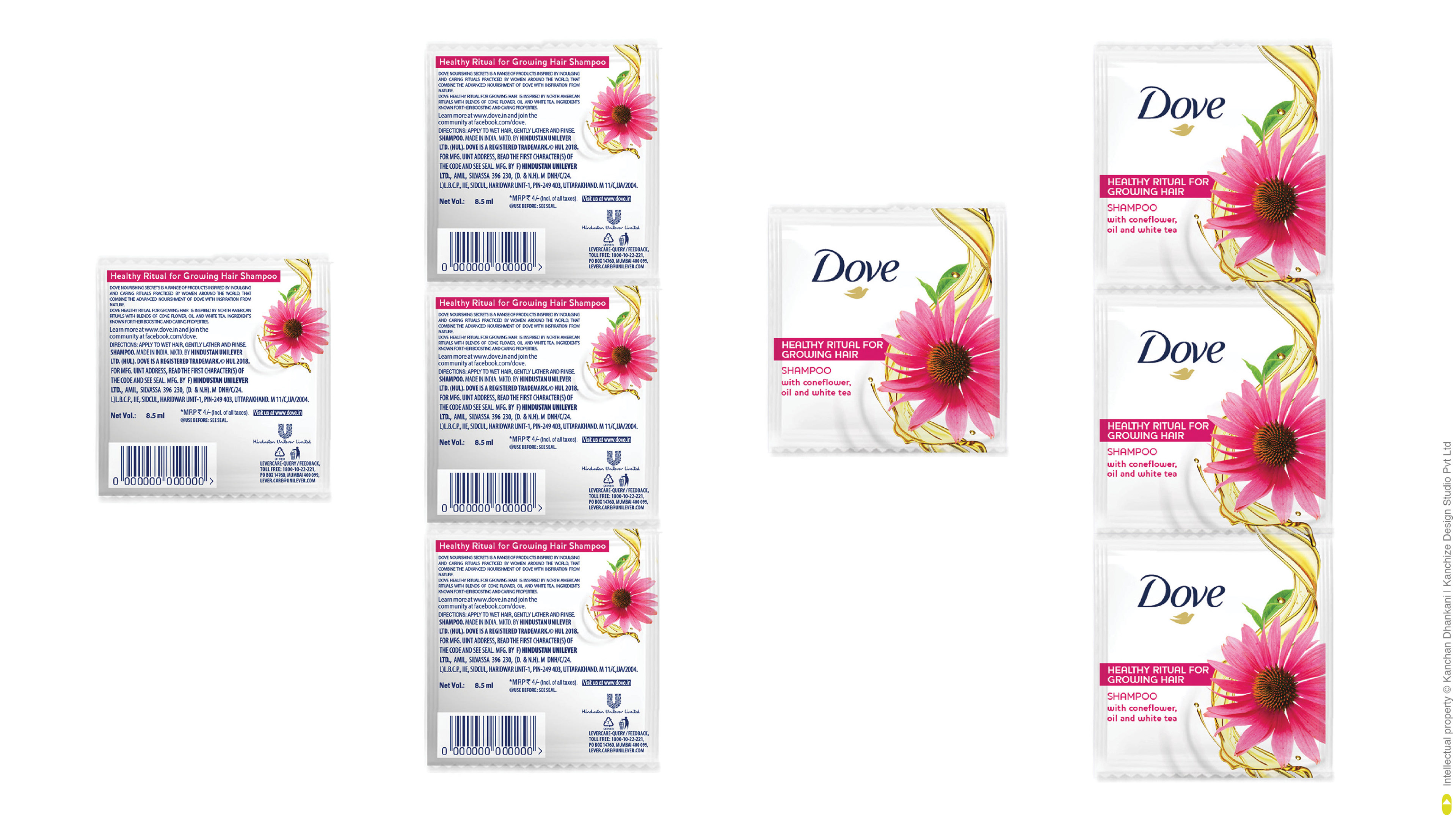
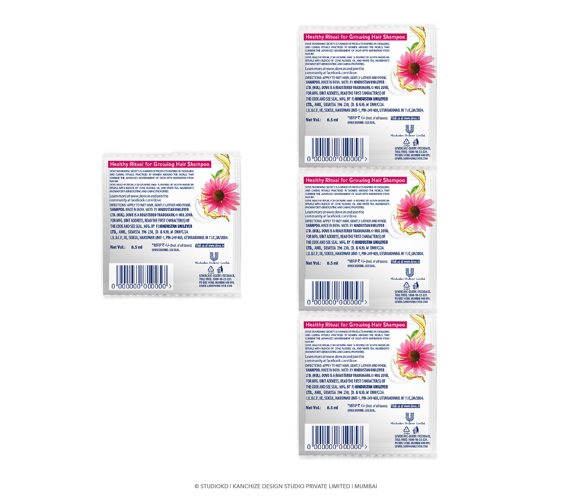
Dove Healthy Ritual For Growing Hair, Shampoo Sachet Design.
For the first time Dove came up with a variant that has many bright colours and visuals of ingredients on shampoo pack. The delicious ingredients needed the attention at the same time designs must not deviate from the "1/4th moisturising cream" idea. Designing the sachet included a challenge of not alienating too far from the Dove shampoo cues and maintaining the cream story that exist on current variants and all of this on a very small face of sachet pack. Designs must yet have the minimalistic design approach, was the brief. After a few attempts of designs we thought of optimising usage of space by using a flow design. The design has one side very minimalistic and white. On the other side the ingredients Coneflower and white tea are shown in a flow that connects one sachet to another seamlessly. This way we get full attention and coverage on ingredients and also maintain Dove codes of maximum white.
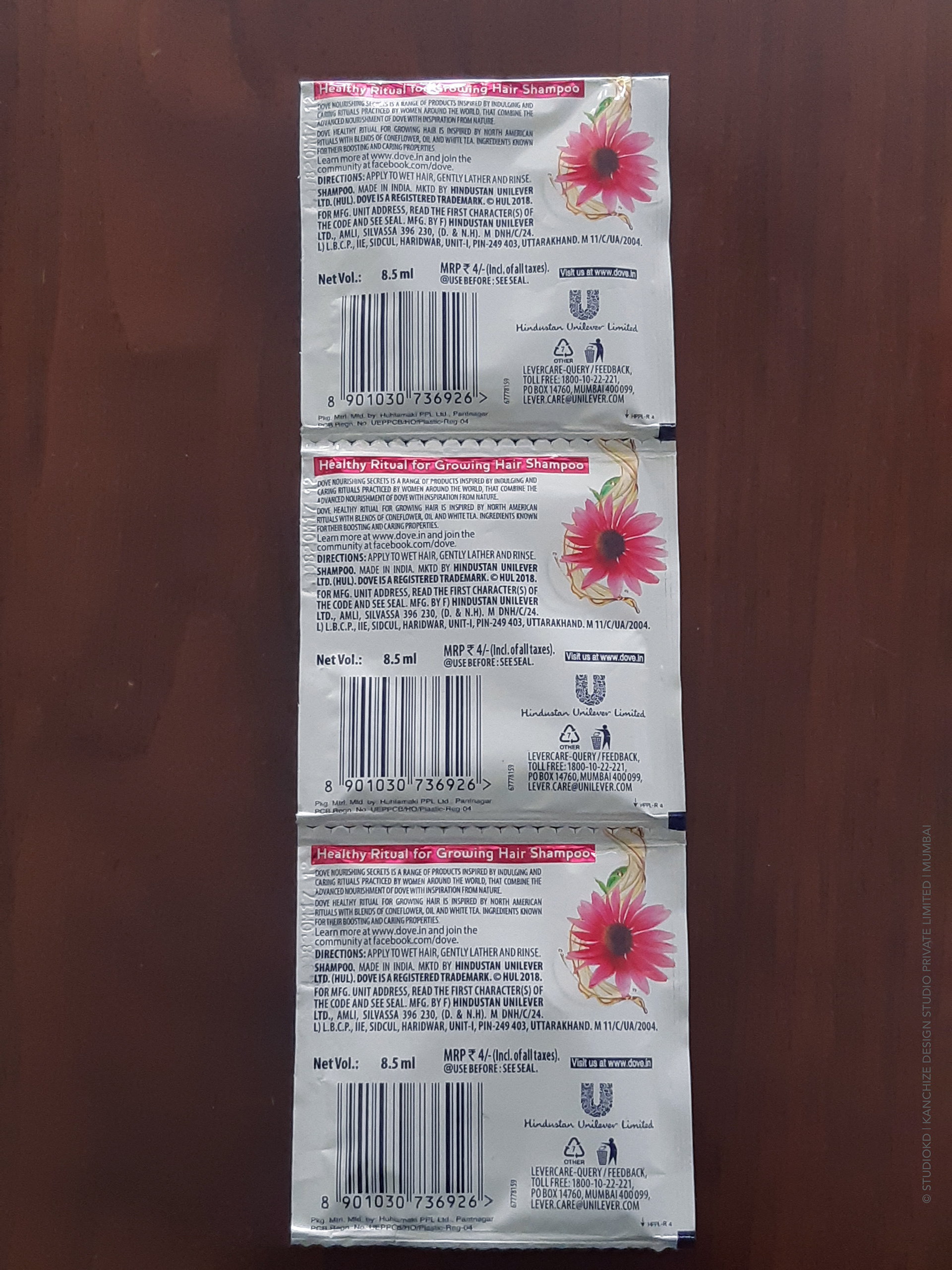
There were a couple of technical challenges that we managed to overcome despite of overruling the guides (printing margins)
The balance of design and maintaining of cream cues with white codes were appreciated by our client. We are happy to deliver designs that "break the clutter" and solves purpose of the project.
Thanks to everyone involved in the project to make challenging designs launch in market.
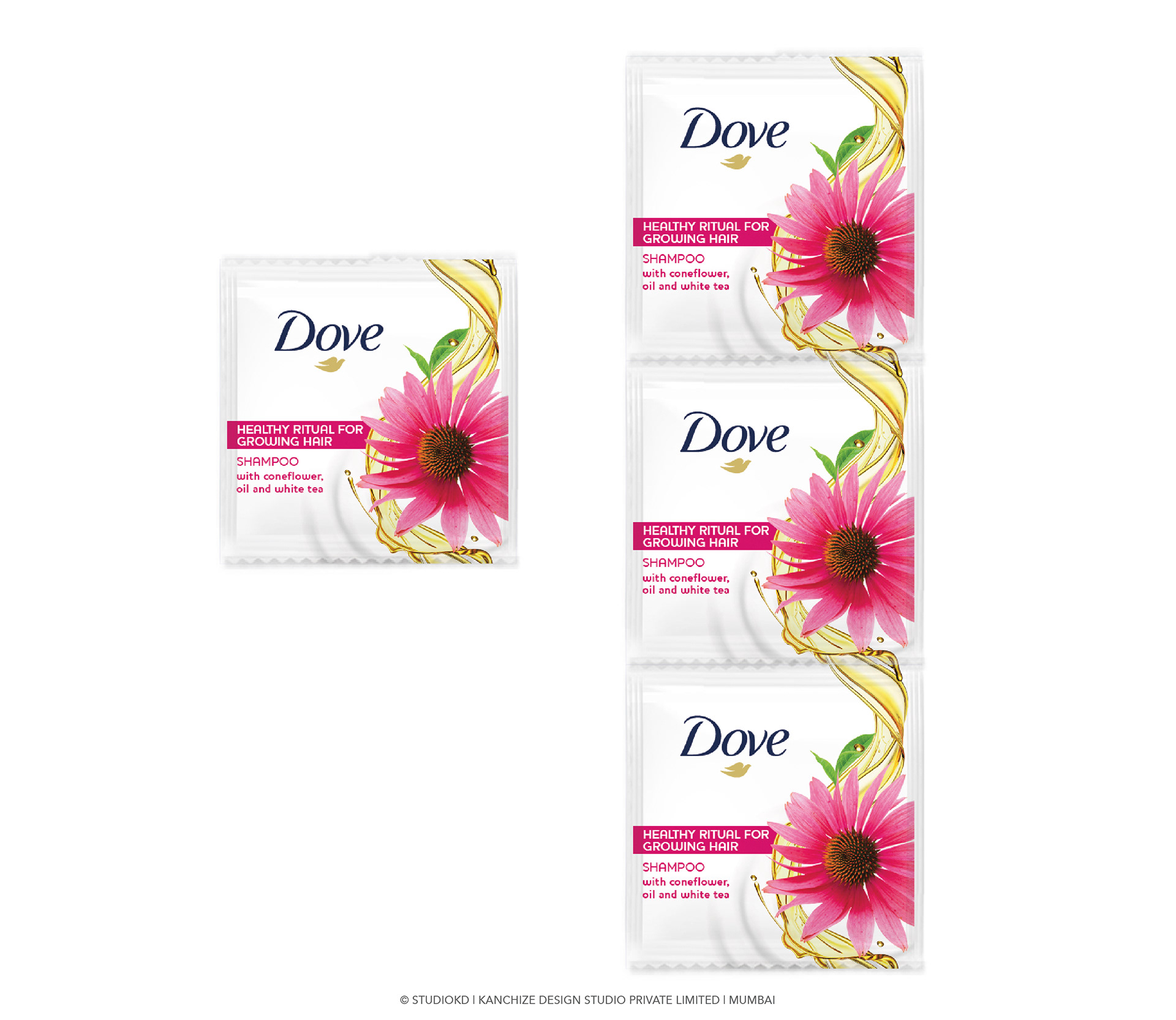
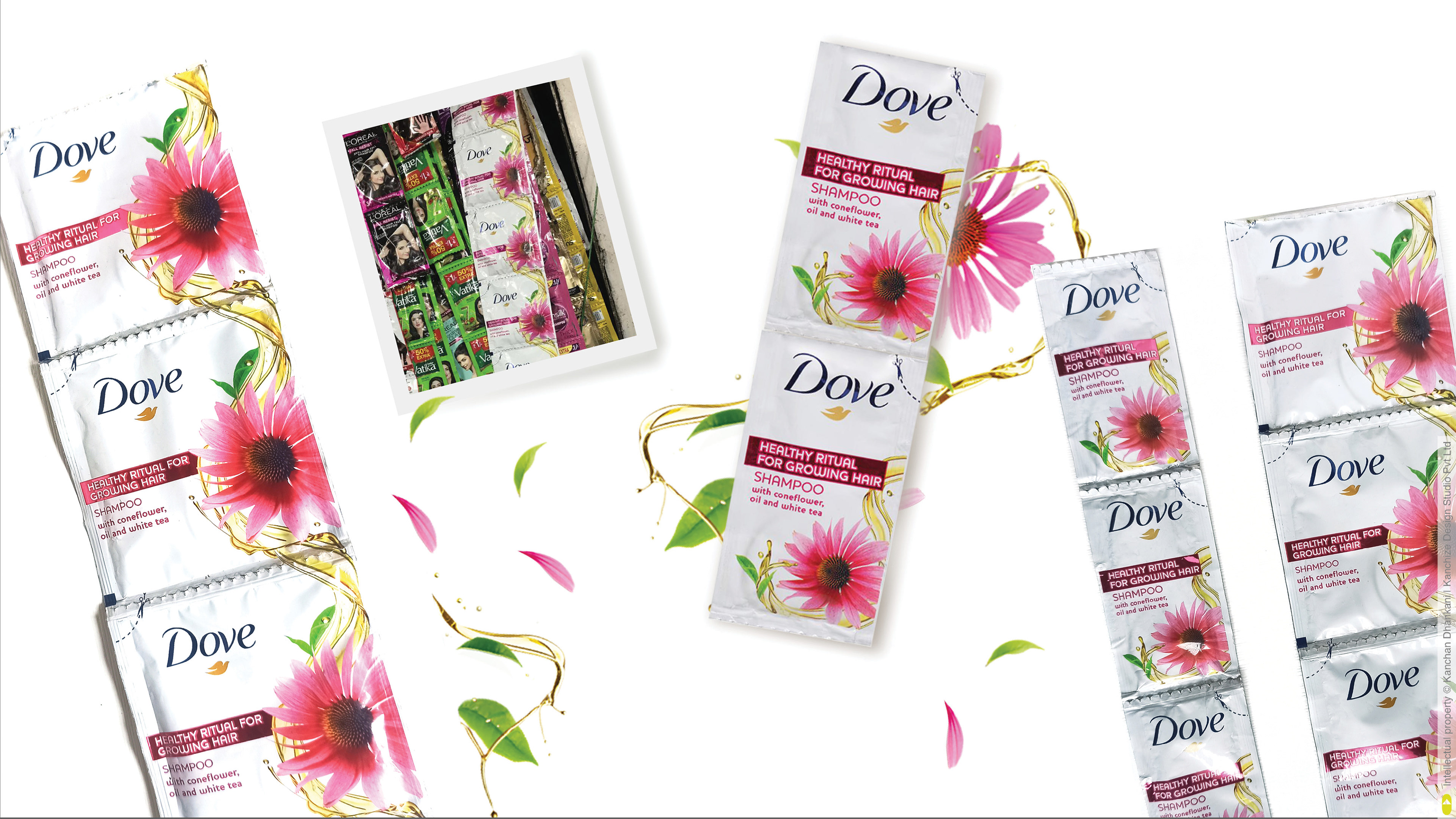
Flower image is made to look lively by giving flying petals effect ... the movement of petals are built to detail the feel of flowing ingredients on all the packs.
milk cream image is used in a very subdued manner to connote the same goodness of Dove shampoo along with new natural ingredients.
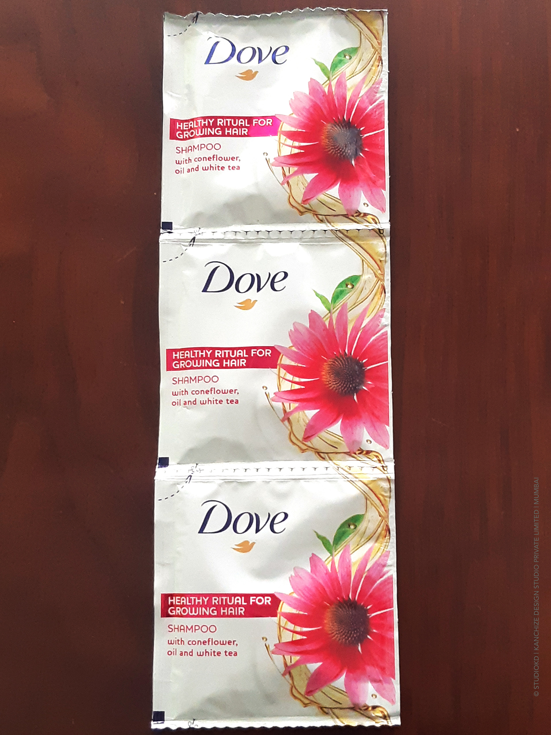
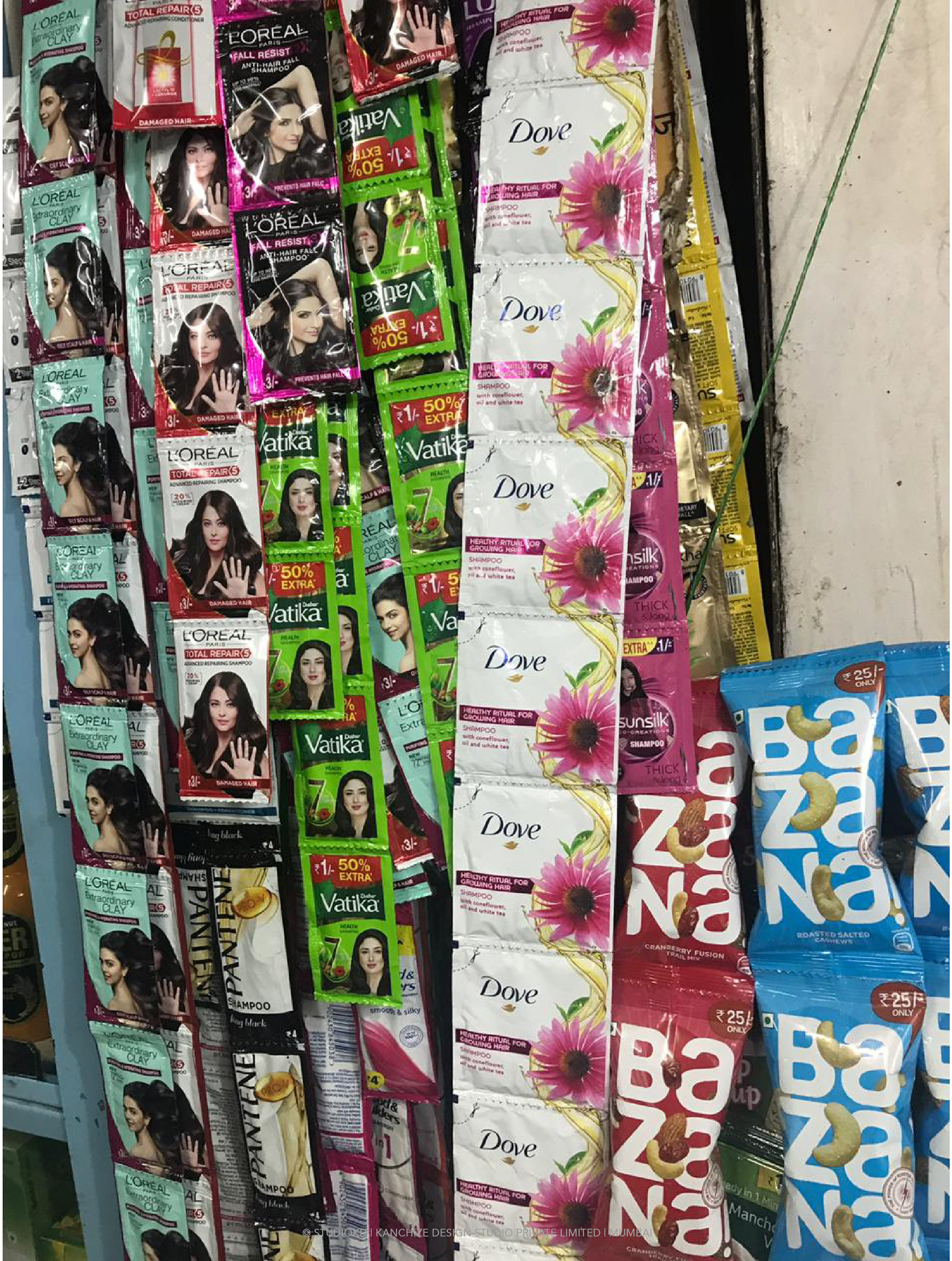
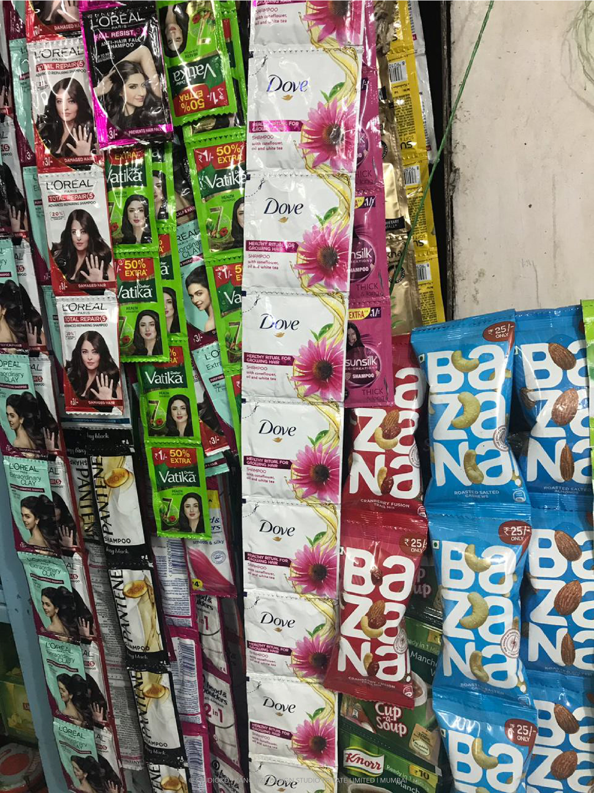
The flow of ingredients helps visibility of sachets and also differentiates from competition.
Shelf throw is always a challenge in sachet market and we are working towards improving visibility of sachets over many upcoming projects.
Stay tuned for more :)