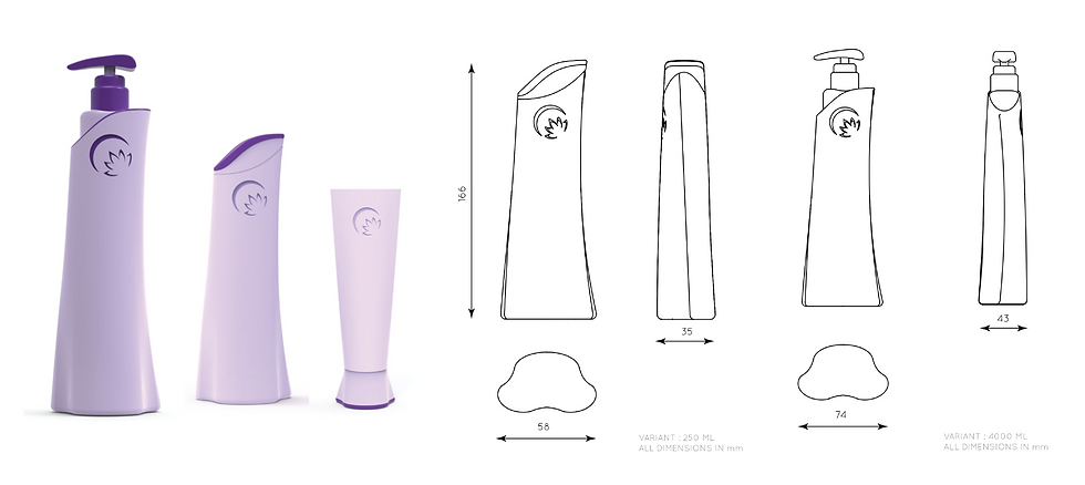
Lotus Body Lotion
Structural Design
Introduction
At Kanchize, we were invited to redesign the structural packaging for Lotus Herbals Body Lotion. The aim was to replace its rigid, masculine look with a feminine, premium form rooted in purity and care.

Brief
Redesign body lotion packaging to appeal to women, create a cohesive SKU system, and introduce new pack sizes. The solution needed to enhance shelf presence, feel aspirational, and reinforce brand identity.
Research
User insights showed trust in the product but dissatisfaction with packaging appeal and consistency. Competitor analysis, brand cues, and natural inspirations like petals and flow guided design directions.
Criteria
Packaging had to be feminine, unique, and commercially viable. It required ample branding space, strong shelf throw, easy squeez-ability, timeless appeal, and avoidance of rigid, masculine forms.
DESIGN DIRECTION 01
This direction is based on the user persona, reflecting feminine qualities in the bottle form. Contours and surface details bring out a soft, aesthetic character.
Keywords: Graceful, Curvy, Gentle, Delicate, Feminine.

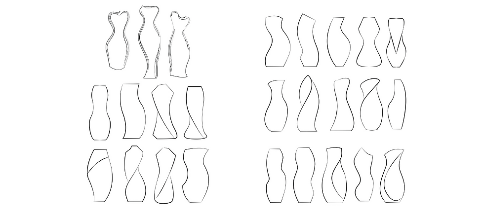

DESIGN DIRECTION 02
These designs draw inspiration from the world of fashion and modeling — reflecting the elegance, stance, and flow of the feminine form. Each bottle embodies qualities like Fashionable, Sassy, Bold, Lively, and Poised, capturing movement and character in form.
Keywords: Fashionable, Sassy, Bold, Lively, and Poised


DESIGN DIRECTION 03
In the following designs, cues have been taken from the brand name itself , i.e, LOTUS. Bud, Bloom , Nature, Fresh, Floral, Leaf, Drop, Petals,Tender.
Keywords: Bud, Bloom , Nature, Fresh, Floral, Leaf, Drop, Petals,Tender.


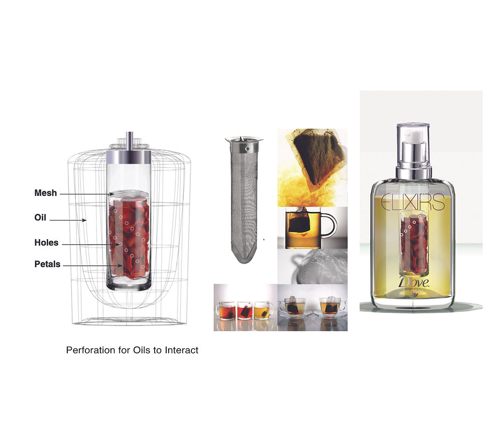
Outcome
Open-ended brief served as an exploratory canvas for the designer, which was validated at each stage with formulation and brand team. Here design marched out beyond the visual and structural space to dive deep into consumer perception, behaviour interpretation and product formulation.

DESIGN DIRECTION 04
Inspired by lotion-like liquids, the forms evoke Smooth, Milky, Creamy, Stout, and Round qualities — chosen to express softness, richness, and nourishment.
Keywords: Smooth Milky Creamy Stout Round
Outcome
Open-ended brief served as an exploratory canvas for the designer, which was validated at each stage with formulation and brand team. Here design marched out beyond the visual and structural space to dive deep into consumer perception, behaviour interpretation and product formulation.

Outcome
Open-ended brief served as an exploratory canvas for the designer, which was validated at each stage with formulation and brand team. Here design marched out beyond the visual and structural space to dive deep into consumer perception, behaviour interpretation and product formulation.

PRODUCT DEVELOPEMENT