
Soap Structure Design
Structural Design
Introduction
This project explores how brand identity can be translated beyond communication into physical product form. Using AXE and Camay as contrasting case studies, we examined how two heritage personal care brands—each with a distinct gendered positioning—can express their core values through soap design.
Project 2 Tata GoFit Plant Protein
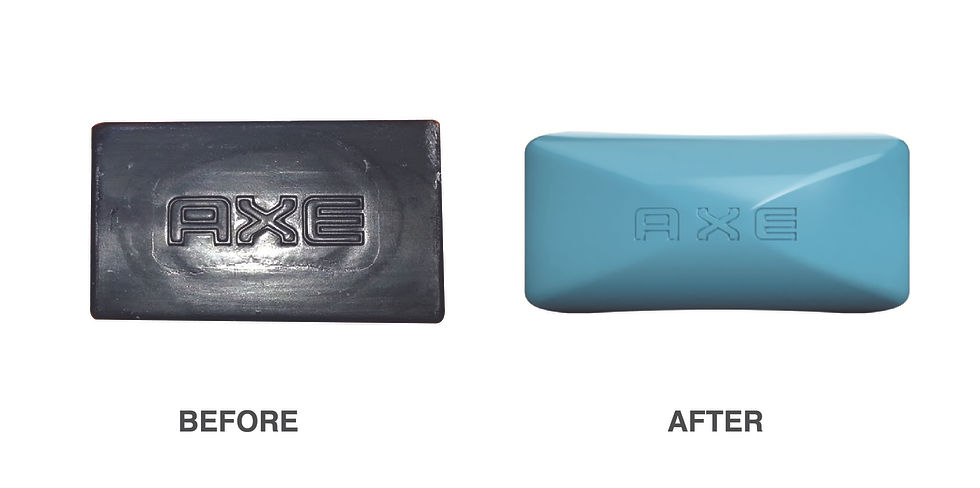
Project 1 AXE
Challenge:
Creating a cohesive brand identity across diverse formats with varying space constraints, despite the ratio difference between the Apple Cider and Plant Protein.
Ensuring brand consistency while accommodating different product categories.
Solution:
Flexible Design System: Kanchize developed a flexible design system that could adapt to different formats while maintaining brand essence. The use of a consistent color palette, typography, and imagery helped to create a unified look and feel. Smart Space Utilization: By optimizing layout and typography, Kanchize Team effectively utilized the limited space on the apple cider packaging, ensuring clear communication of product information.
The copy writing of information maintaining hierarchy consistency also played an important role.
AXE has long positioned grooming as a source of confidence and attraction, evolving from the iconic “AXE Effect” to a more inclusive and expressive view of modern masculinity—while continuing to celebrate the power of fragrance.
The soap form incorporates sharp, confident geometry softened by smooth contours, reflecting AXE’s balance of boldness and approachability. A sleek, polished surface finish cues freshness and sensorial appeal, aligning with AXE’s fragrance-driven identity. Together, these elements transform the soap from a functional object into a physical expression of AXE’s confidence, magnetism, and self-expression.

Project 2 Camay
Camay with its roots in paris has long stood for timeless femininity and refined beauty, positioning itself as a classic, fragrance-led soap that celebrates elegance, softness, and confidence. Rooted in heritage yet evolving with modern sensibilities, the brand expresses luxury through subtlety—where scent, touch, and form come together to create an indulgent everyday ritual.
Direction 1 — Parisian Architecture & Soft Curvature
Inspired by classic French architecture and flowing Parisian forms, this soap features gentle curves and sculpted softness that evoke timeless femininity, understated luxury, and the elegance Camay is known for.


Camay
Direction 2 — French Gastronomy & Organic Flow
Drawing from the fluid, organic forms of French cuisine and natural elements, this soap embraces smooth contours and sensorial tactility, expressing indulgence, grace, and the refined beauty central to Camay’s feminine identity.


Conclusion
Kanchize Design Studio's ability to successfully harmonize diverse product portfolios demonstrates their deep understanding of branding and design principles. By creating flexible design systems and leveraging a consistent visual language, Kanchize has helped clients achieve brand recognition, differentiation, and consumer appeal.
By showcasing these successful projects, Kanchize Design Studio continues to solidify its position as a leading design firm, committed to delivering innovative and impactful solutions.